
A strong online presence is critical for organizations of all sizes in today’s digital era. A responsive website design is critical to attaining this aim. In this post, we will look at the importance of responsive website design and how it may help your business grow.
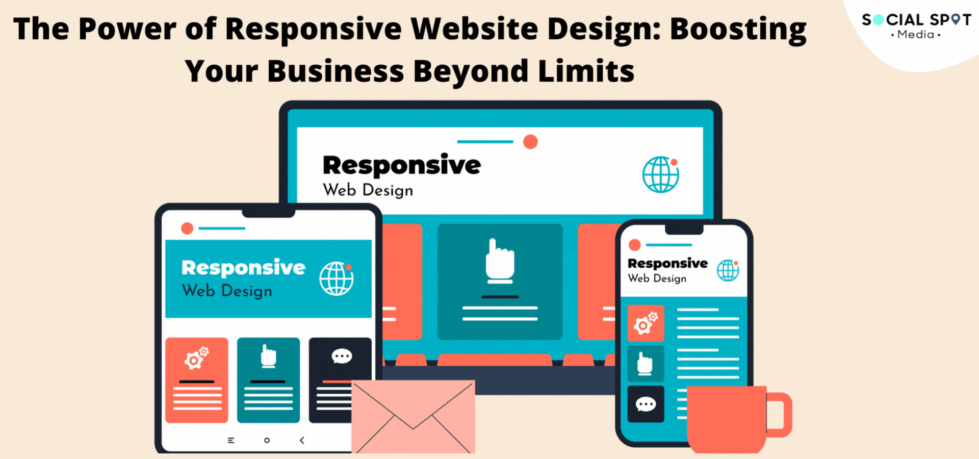
Recognising Responsive Website Design
The concept of designing web pages that adapt and function fluidly across multiple devices and screen sizes is referred to as responsive website design. A responsive website guarantees that the user experience stays consistent and user-friendly whether your clients are surfing on a desktop computer, a tablet, or a smartphone.
Why is Responsive Design Important?
Responsive website design is no longer a trend; it is a must in today’s digital world. Here are some strong reasons why this is important:
1. Better User Experience
A responsive website optimizes viewing and interaction, making it easier for people to traverse your site. This leads to higher engagement and longer visit durations.
2. Better SEO Rankings
Google and other search engines prioritize responsive websites in their results. A responsive design increases your chances of appearing higher in search engine results, delivering organic traffic to your site.
3. Accessibility on Mobile Devices
With an increasing number of visitors accessing websites via mobile devices, a mobile-friendly design is critical. A responsive website guarantees that your content is available to everyone, regardless of device.
The Financial Impact
Let’s take a look at how responsive website design may help your business.
1. Higher Conversion Rates
A website that is responsive is more likely to turn visitors into buyers. Users are more likely to make a purchase or perform desired activities when they can simply navigate and engage with your site on their preferred device.
2. Lower Bounce Rates
Bounce rates arise when visitors quickly abandon your site after entering. A responsive design minimizes bounce rates by offering a seamless and engaging user experience, encouraging users to dig deeper into your information.
3. Better Brand Credibility
A well-designed, responsive website will benefit your brand. It expresses professionalism and a commitment to offering an excellent user experience, which may aid in the development of trust with potential clients.
Making a Mobile-Friendly Website
Now that you understand the significance of responsive website design, let’s look at how to make one:
1. Mobile-First Strategy
Begin by designing for mobile devices and then go to larger screens. This method guarantees that your site is optimized for smaller displays, which is critical in today’s mobile-first era.
2. Fluid Grid Layouts
Use fluid grid layouts that automatically modify information to fit the size of the screen. This enables a smooth transition between devices.
3. Image and Media Flexibility
Ensure that photos and media assets are also responsive. They should be able to scale and adapt to different screen sizes without sacrificing quality.
Conclusion
To summarise, flexible website design is more than simply a technological advancement; it is a strategic imperative for organizations seeking to succeed in the digital age. You can take your business to new heights by offering an amazing user experience across all devices.
But don’t just take our word for it; see for yourself the potential of responsive design. Take the initial step towards increasing your web visibility from Social Spot Media.

Grow your business online with our Digital Marketing Services through our Social Spot Media Company.
Agency(1)
Business(5)
Marekting(2)
Seo(2)